Piz Grotesk
Casefilm
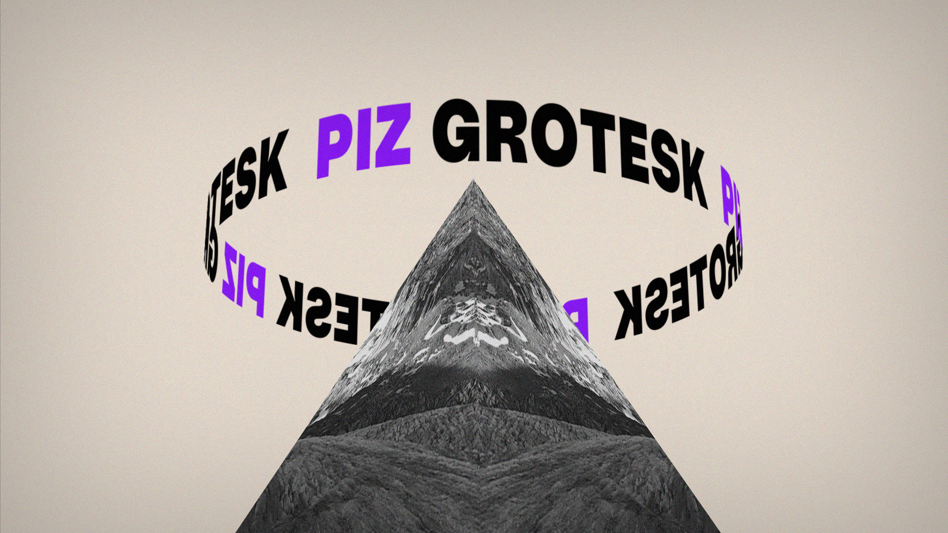
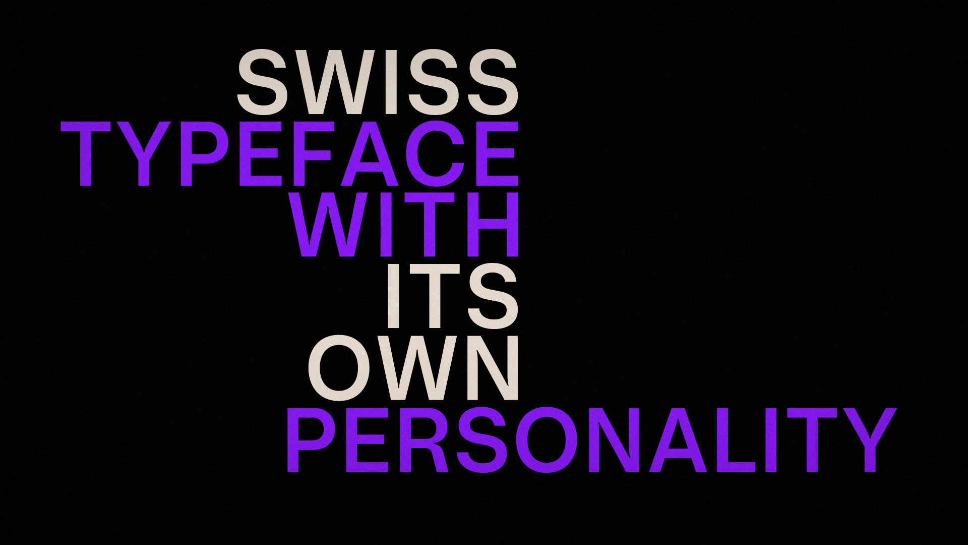
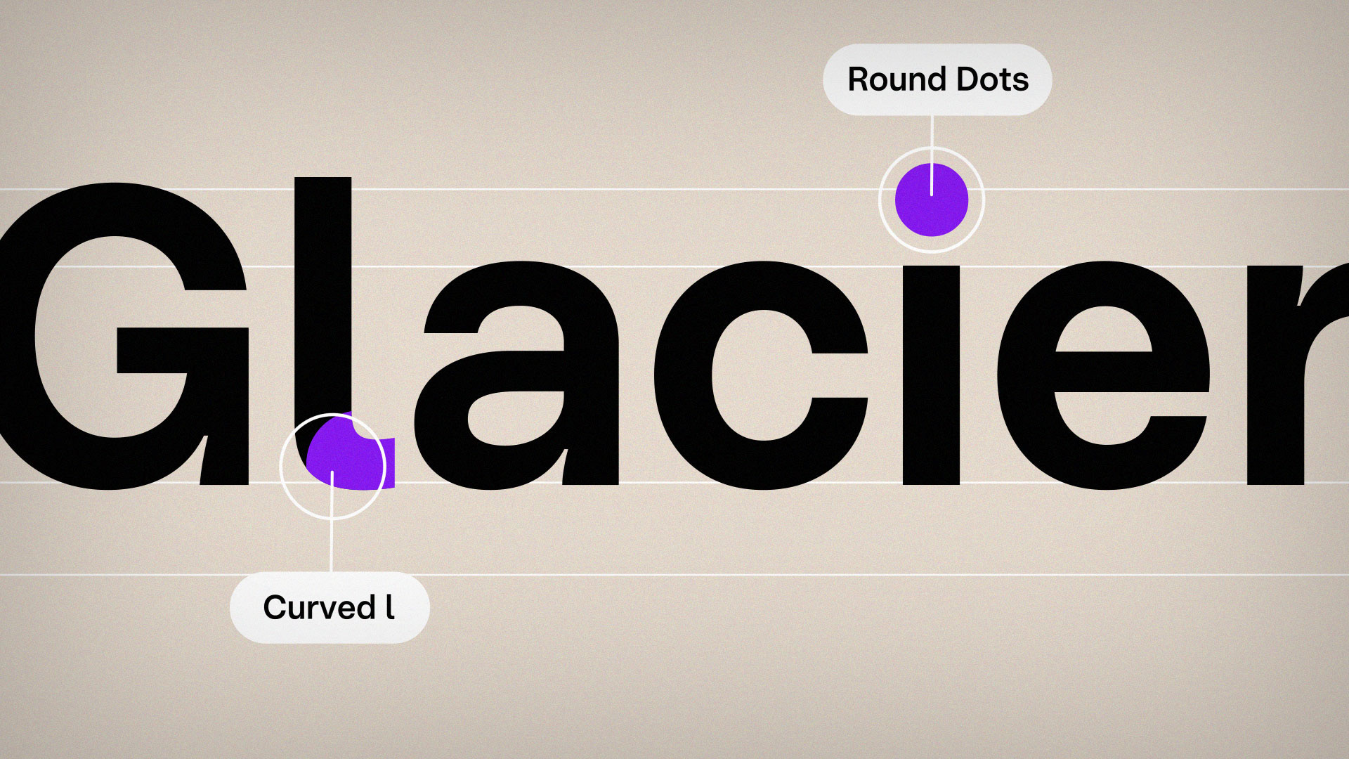
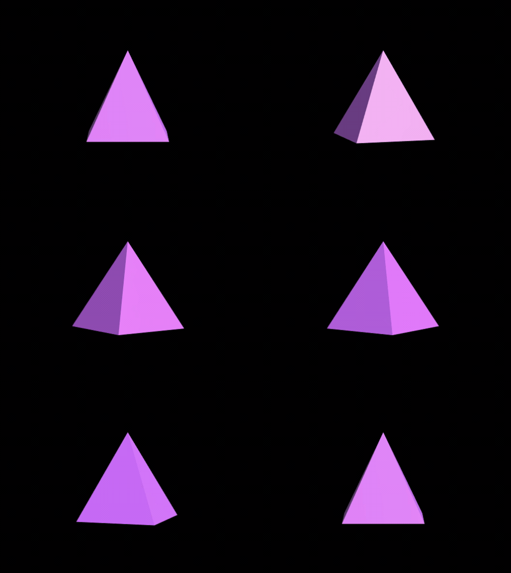
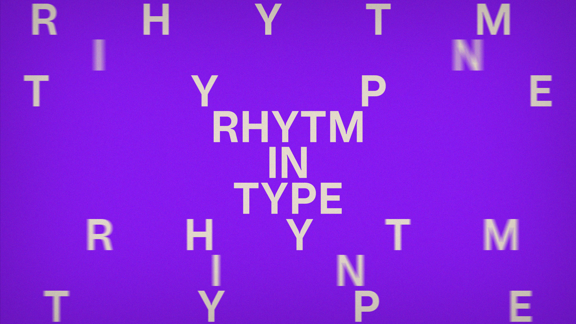
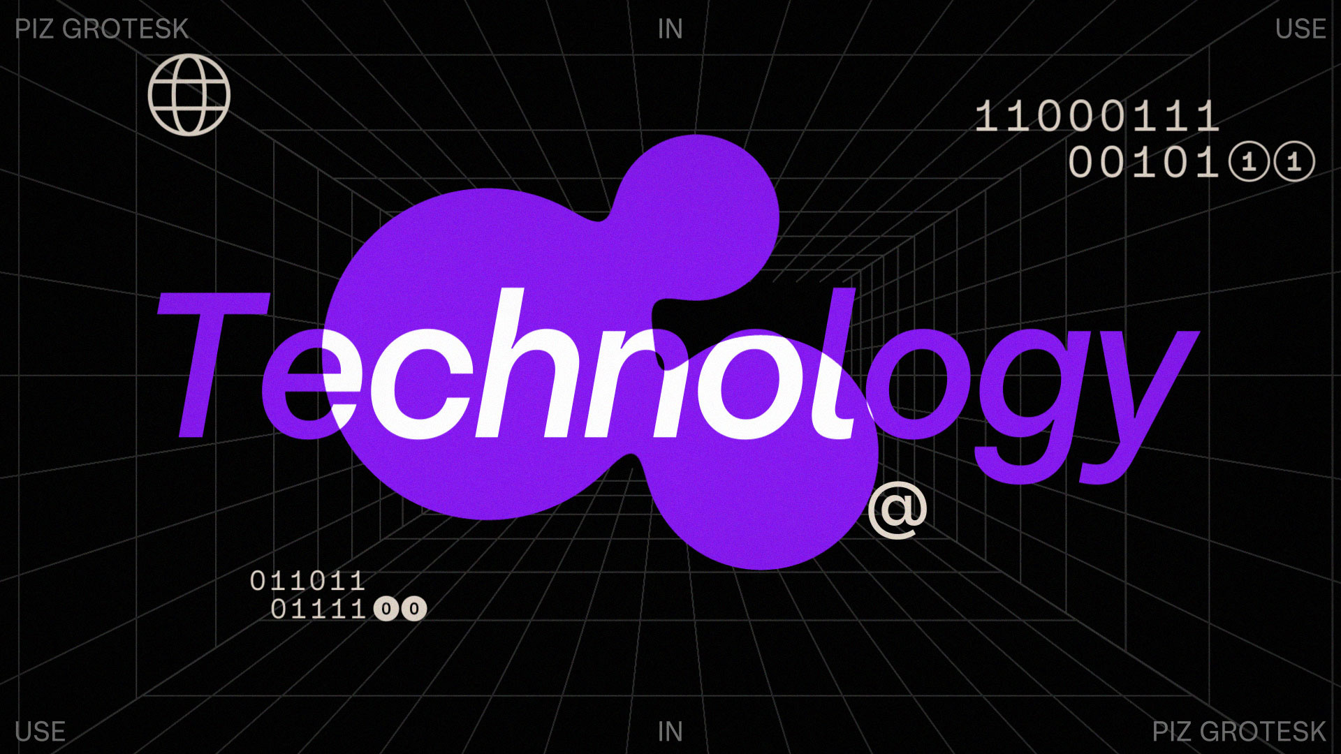
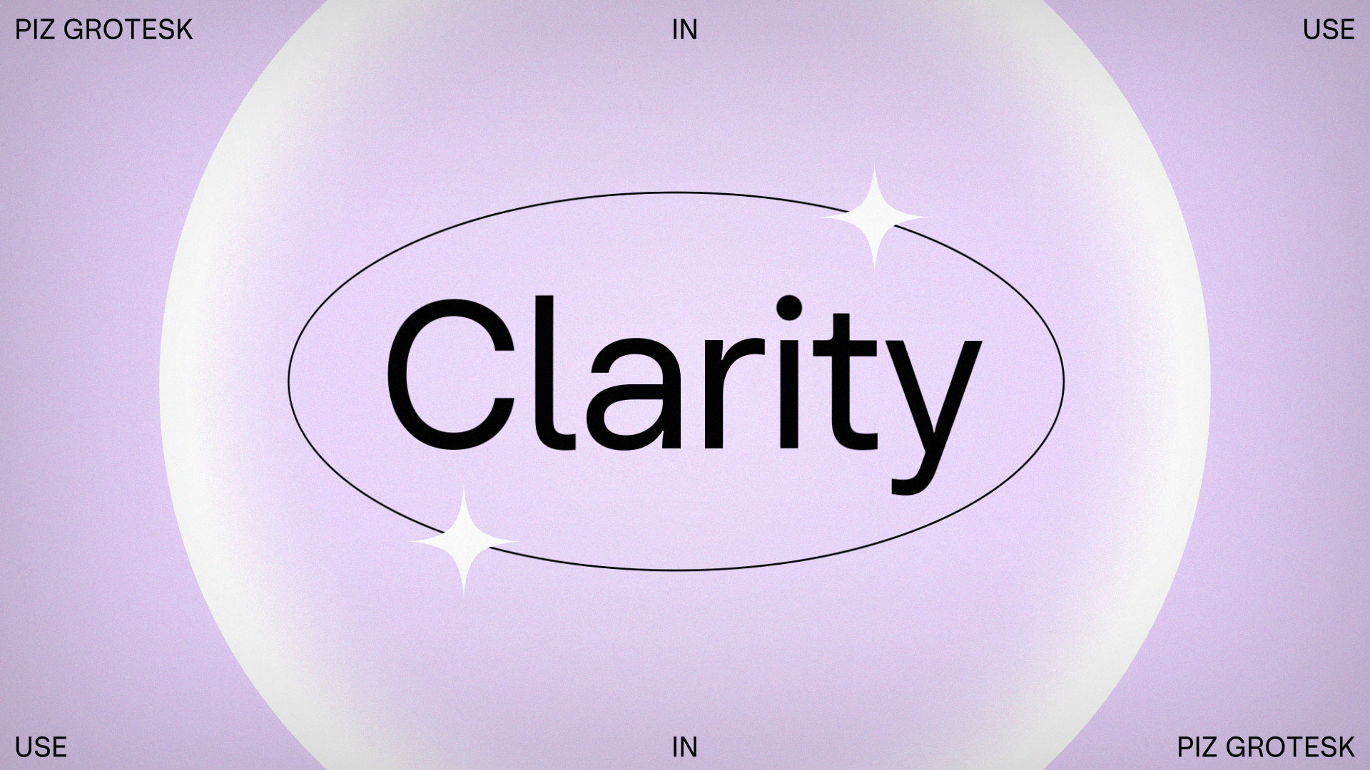
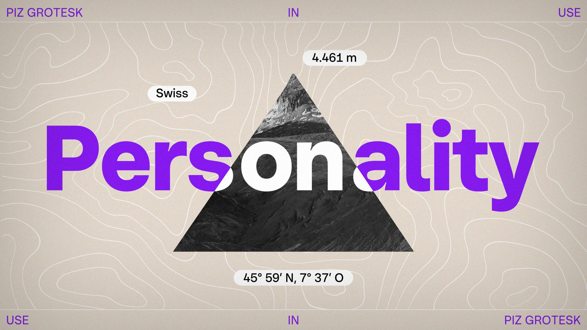
Eine Schrift zwischen Gletscher und Raster. Piz Grotesk vereint alpine Inspiration mit der Klarheit des Swiss Design – genau dieses Spannungsfeld bildet die Grundlage der Animation. Schichtungen wie im Eis, Bewegung unter der Oberfläche und markante Kanten treffen auf strenge Komposition, präzise Linienführung und reduzierte Typo-Settings. Das dreidimensionale Dreieck als abstrahierter „Piz“ fungiert als visuelles Leitmotiv. Es steht für Herkunft, Konstruktion und Höhepunkt zugleich. Klare Flächen und systematische Raster zitieren die Schweizer Designtradition, während harte Schnitte, radikale Skalierungen und rohe Kontraste eine subtile Brutalism-Note einbringen. Close-ups auf Tintenfallen, runde Punkte und geschwungene Segmente machen die Verbindung von technischer Präzision und organischer Form sichtbar. Eine Inszenierung, die Klarheit nicht nur zeigt, sondern inszeniert.
A font between glacier and grid. Piz Grotesk combines Alpine inspiration with the clarity of Swiss design – it is precisely this tension that forms the basis of the animation. Layers like those in ice, movement beneath the surface, and striking edges meet strict composition, precise lines, and minimalist typography settings. The three-dimensional triangle as an abstracted “Piz” serves as a visual leitmotif. It stands for origin, construction, and climax at the same time. Clear surfaces and systematic grids reference Swiss design tradition, while hard cuts, radical scaling, and raw contrasts introduce a subtle touch of brutalism. Close-ups of ink traps, round dots, and curved segments reveal the connection between technical precision and organic form. A production that not only shows clarity, but also stages it.
Credits: Design •Motion Design•Art Direction
Kunde: Serpentype
Jahr: 2026